Thursday, 29 March 2012

Book Cover

Today we were set the task of designing a book cover for the book 'One Flew Over the Cuckoo's Nest' by Ken Kesey. We were also given the opportunity to choose our own book to do a cover of so I chose the first book to the Darren Shan saga, 'Cirque Du Freak'.

In the book the main character (Darren Shan) goes to see the secret freak show 'Cirque Du Freak' in an abandoned theatre with his friend Steve, where one of the performers is a secret vampire (Larten Crepsley). Darren steals the vampires deadly performing spider because of his interest in arachnids, but things go horribly wrong and he is forced to become the vampires assistant to save Steve.

I chose this book because I wanted to do an illustrated cover, and it had a lot of interesting themes/characters.

Here are some of the existing covers: 


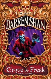
This first cover is new and is only in the UK, it shows the vampire character and the spider, and I really like the tone of the illustration, I don't like the gold/orange border though, as it seems to cluttered.

This is the original cover, the imagery is good and creepy and very minimalistic but I personally think it's a bit boring. 

This is the cover I produced:
Like the UK cover, I did an illustration of the vampire character and the spider, as both characters are central to the plot. I originally wanted to do a silhouette but I also wanted a dark background so it wouldn't have worked. Instead I did a normal illustration but with a light source from behind, I did this because I wanted the spider to really stand out, but because of the dark-ish colours it would be hard, hence why there is a shadow between his hands/under the spider. Finally I added a web, as it looked odd with the spider just floating there.

For the text I used the font called Carnevalee Freakshow, as it had the creepy circus feel I wanted.

Wednesday, 28 March 2012

Final works


These are my finished content sheets for both pages

Statement of Intent and thumbnails

For this module I intend to make a magazine showing accessory designs inspired by different themes, for the first double page spread the theme will be Steampunk, and for the second spread the theme will be Alice in Wondelrand.

These are my thumbnails for my magazine, i used the resources below to get the specific feel for each page while still having a the stripes to tie all the pages together.

http://www.dafont.com/jellyka-delicious-cake.font
http://www.dafont.com/james-han.font
http://www.dafont.com/jenna-sue.font

http://mezzochan.deviantart.com/art/Lace-Borders-Stock-168080840
http://szuia.deviantart.com/art/grunge-brushes-78728649

these are my initial sketches for my content (Left: Wonderland Right: Steampunk)

Wednesday, 29 February 2012

Designer research

http://jppcacapture.blogspot.co.uk/2010/12/neville-brody.html
http://jppcacapture.blogspot.co.uk/2010/10/david-carson.html

Tuesday, 28 February 2012

Magazine research

For our magazine project I have decided to make a magazine full of accessories inspired by certain themes:

Steampunk:


Steampunk has recently become more mainstream, it's a genre that is heavily themed around the industrial revolution and is a mixture of sci-fi, fantasy, and horror. Recurring themes inclue gears, pipes, cogs, steam operated machines ect. it's also rather grungy, so metals like copper and brass are popular.

http://www.buysteampunk.com/
http://www.fanpop.com/spots/steampunk/images/23477037/title/steampunk-fashion-photo

Here are some images of existing steampunk inspired accessory's.

http://www.highfashiongirl.com/2008/05/steampunk-willy.html
http://offbeatbride.com/2012/01/ear-cuffs
http://www.geeky-gadgets.com/geeky-accessories-the-steampunk-watch-cufflinks/

Wonderland

The second area I looked at was Alice in Wonderland, the simple story has become very popular recently, resulting in a lot of takes on the story. Recurring themes include; cards, rabbits, chess pieces, the colours red and white, characters/themes from the book.

http://www.thefashionpolice.net/alice-in-wonderland-halloween-party-costume-ideas.html
http://karlafrazetty.deviantart.com/art/Alice-in-wonderland-111130642

Here re some examples of existing accessories:

http://cherishedtrinkets.co.uk/alice-in-wonderland/my-latest-alice-in-wonderland-jewellery-designs/
http://www.thisnext.com/item/A8801A8C/Disney-Cheshire-Cat-Alice-in

http://cherished-trinkets.blogspot.co.uk/2009/05/alice-in-wonderland-vintage-style-charm.html
http://recyclebabe.blogspot.co.uk/2010/05/who-doesnt-love-alice-in-wonderland.html


Lolita

The last style I looked into was Lolita, it originated in japan and was influenced by victorian clothing, many sub-styles exist in Lolita but the main one is based around anything cute. Recurring themes; ruffles, lace, frills, pastel colours, bows, victorian themes (mini top hats, corsets ect.)

http://www.mookychick.co.uk/alternative-fashion/japanese-fashion-styles/western-lolita.php
http://ulolita.com/index.php?main_page=product_info&products_id=14

Here are some examples of existing accessories:

http://www.kaboodle.com/reviews/sweet-lolita-accessories-brooch-by-zefora-on-etsy
http://www.tokyomade.com/blog/2007/09/sweet_treats_from_pink_salon.html
http://www.talkingclothes.se/en/accessories/
http://weheartit.com/entry/11640289

In the end I decided to do a Steampunk page, and a Wonderland page, if I have time I might to a Lolita page too, but Steampunk and Wonderland will be my priority.


Thursday, 23 February 2012

Portfolio research

Today we started researching portfolio's online and I found a good website (http://carbonmade.com) where you can see loads of online portfolio's. I found some really good examples of good and bad portfolio's, most had a white background with clearly labelled buttons for different sections of their work like this http://aitch.carbonmade.com/, this gives your portfolio a nice professional look while also making the page easy to navigate, you can also see a consistent style throughout their portfolio although they have also showcased their various skills, also they have contact information so if your interested you can get in contact.Another good point of this portfolio is the fact they have their own logo in the top left which acts like a home button as well. An example of a bad portfolio comes from http://julldiaz.carbonmade.com, the dark background really doesn't work and the way the one section is in the upper left corner emphasizes the fact that there's only one. It also looks like the artist was too lazy to make any more, a simple thing like having it centred would make the whole think look better as it would look like it belonged there on it's own. Also the about me section is all in Mexican which isn't helpful to any foreign potential employers, also she only has one image in her gallery which isn't very inspiring as you have no idea how she draws other things. The best blog I found was http://cakeandkingdom.carbonmade.com/, a very cool looking portfolio where he doesn't just add a caption to an existing image for his buttons, the text is made part of the art which really draws attention to him and makes his page stand out, even his logo for the homepage is in his artstyle and it stands out a lot. Also his info area has his real name and some background info on him as well as his contact info ect. which helps give his portfolio life and a realistic feel as instead of just a bunch of images on a webpage it's the work of this one guy with a quirky art-style and personality.

Wednesday, 11 January 2012

Experimentations in InDesign


Adobe InDesign is a program commonly used for printing purposes (magazines ect.) at the beginning of this module we did various tutorials in it.

InDesign works in a similar way to photoshop and illustrator, you have the options to use layes, text, the pen tool ect. in addition to all this you haves pages and lost of other tools.

You can choose to work specifically for web or print, and choose from a variety of preset sizes or input your own, you can also control orientation, margin size, number of columns ect.

While in InDesign the margins you chose earlier show up, and you will notice that the program has a snap guide function. If you are moving something and it's next to a margin line, the edge of the page, the center of the page or even parallel to something else of the page it will automatically 'snap' there, so you can arrange things precisely.

Alongside the page function you have the option to use a master page, this is a page not on your document which you can add something (say a logo) and it will show up on-top of all the pages in your document. You can toggle this on and off on each page and it is a great resource.

We also played around with the text tool and shape tools, and then we moved onto buttons. First we changed the workspace to interactive, then we opened the 'button' tab. To make a button you simply select what you want for the button and click on the 'normal' layer in the button box, it should be greyed out but it'll become active as soon as you click. You then simply add the action you want it to do but clicking on the plus sign on the click layer. We used buttons for various things including playing music/video.

We also looked at bringing in files from photoshop into inDesign, one way to import a specific part of an image into inDesign is to use a clipping mask, you simply outline the area of the image that you want with the pen tool, then if saved in TIFF format you can import the image and the clipping path into inDesign. Anything outside of the closed path will be invisible, you can also edit the path in inDesign.