http://jppcacapture.blogspot.co.uk/2010/12/neville-brody.html
http://jppcacapture.blogspot.co.uk/2010/10/david-carson.html
Wednesday, 29 February 2012
Tuesday, 28 February 2012
Magazine research
For our magazine project I have decided to make a magazine full of accessories inspired by certain themes:
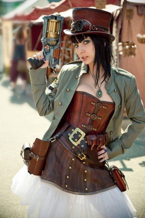
Steampunk has recently become more mainstream, it's a genre that is heavily themed around the industrial revolution and is a mixture of sci-fi, fantasy, and horror. Recurring themes inclue gears, pipes, cogs, steam operated machines ect. it's also rather grungy, so metals like copper and brass are popular.


Steampunk:
Steampunk has recently become more mainstream, it's a genre that is heavily themed around the industrial revolution and is a mixture of sci-fi, fantasy, and horror. Recurring themes inclue gears, pipes, cogs, steam operated machines ect. it's also rather grungy, so metals like copper and brass are popular.

http://www.buysteampunk.com/
http://www.fanpop.com/spots/steampunk/images/23477037/title/steampunk-fashion-photo
Here are some images of existing steampunk inspired accessory's.

http://www.highfashiongirl.com/2008/05/steampunk-willy.html

http://offbeatbride.com/2012/01/ear-cuffs

http://www.geeky-gadgets.com/geeky-accessories-the-steampunk-watch-cufflinks/
Wonderland
The second area I looked at was Alice in Wonderland, the simple story has become very popular recently, resulting in a lot of takes on the story. Recurring themes include; cards, rabbits, chess pieces, the colours red and white, characters/themes from the book.

http://www.thefashionpolice.net/alice-in-wonderland-halloween-party-costume-ideas.html

http://karlafrazetty.deviantart.com/art/Alice-in-wonderland-111130642
Here re some examples of existing accessories:

http://cherishedtrinkets.co.uk/alice-in-wonderland/my-latest-alice-in-wonderland-jewellery-designs/

http://www.thisnext.com/item/A8801A8C/Disney-Cheshire-Cat-Alice-in

http://cherished-trinkets.blogspot.co.uk/2009/05/alice-in-wonderland-vintage-style-charm.html

http://recyclebabe.blogspot.co.uk/2010/05/who-doesnt-love-alice-in-wonderland.html
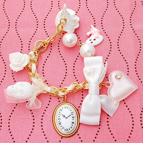
Lolita
The last style I looked into was Lolita, it originated in japan and was influenced by victorian clothing, many sub-styles exist in Lolita but the main one is based around anything cute. Recurring themes; ruffles, lace, frills, pastel colours, bows, victorian themes (mini top hats, corsets ect.)

http://www.mookychick.co.uk/alternative-fashion/japanese-fashion-styles/western-lolita.php

http://ulolita.com/index.php?main_page=product_info&products_id=14
Here are some examples of existing accessories:

http://www.kaboodle.com/reviews/sweet-lolita-accessories-brooch-by-zefora-on-etsy
http://www.tokyomade.com/blog/2007/09/sweet_treats_from_pink_salon.html

http://www.talkingclothes.se/en/accessories/

http://weheartit.com/entry/11640289
In the end I decided to do a Steampunk page, and a Wonderland page, if I have time I might to a Lolita page too, but Steampunk and Wonderland will be my priority.
Thursday, 23 February 2012
Portfolio research
Today we started researching portfolio's online and I found a good website (http://carbonmade.com) where you can see loads of online portfolio's. I found some really good examples of good and bad portfolio's, most had a white background with clearly labelled buttons for different sections of their work like this http://aitch.carbonmade.com/, this gives your portfolio a nice professional look while also making the page easy to navigate, you can also see a consistent style throughout their portfolio although they have also showcased their various skills, also they have contact information so if your interested you can get in contact.Another good point of this portfolio is the fact they have their own logo in the top left which acts like a home button as well. An example of a bad portfolio comes from http://julldiaz.carbonmade.com, the dark background really doesn't work and the way the one section is in the upper left corner emphasizes the fact that there's only one. It also looks like the artist was too lazy to make any more, a simple thing like having it centred would make the whole think look better as it would look like it belonged there on it's own. Also the about me section is all in Mexican which isn't helpful to any foreign potential employers, also she only has one image in her gallery which isn't very inspiring as you have no idea how she draws other things. The best blog I found was http://cakeandkingdom.carbonmade.com/, a very cool looking portfolio where he doesn't just add a caption to an existing image for his buttons, the text is made part of the art which really draws attention to him and makes his page stand out, even his logo for the homepage is in his artstyle and it stands out a lot. Also his info area has his real name and some background info on him as well as his contact info ect. which helps give his portfolio life and a realistic feel as instead of just a bunch of images on a webpage it's the work of this one guy with a quirky art-style and personality.
Subscribe to:
Comments (Atom)